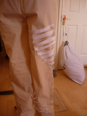


I have finished my jacket toile, having come up with a shape that I am happy with. I intend to digitally print the front and hip panels of the jacket on a thick silk satin and the collar and hip bands will be made out of either silk velvet or cotton velvet. I have also started to toile my trousers. I started by making up the basic toile and then cutting out strips of paper which I then pinned onto the trousers in various positions at different lengths until I was happy with the way that they looked. I then drew on the strip that goes all the way around the legs from the thighs to the ankles. I then took the toile apart, drew out the pattern pieces and loosely stitched them together so I could begin inserting the bands of calico. Once I had done this I sewed the strips into the seams, however I was not happy with the overall look as the bands were too loose. I cut and pinned them back then re-inserted them into my trousers. I intend to make the trousers out of a woven wool and the strips out of the same fabric as the hip panels and collar on the tailored jacket.


 King Charles I


 Although I really like the colour of the previous print I have been experimenting with the same print in different colours and compositions. I have made up a basic toile and printed the images onto fabric and sewn the fronts together to see what it looks like. I prefer the white background, however I am not convinced on the shape of the jacket. I have changed the shape since I decided what I would like to make, making it longer and less volumous. I think that I will change the shape quite dramatically however the toile with the prints on has given me an idea of what a digital print would look like if I was to have it all over. I still think that I prefer the black and white images so I will probably stick with those colours and embellish the 3-dimensional panels which I intend to add with blue beads.


